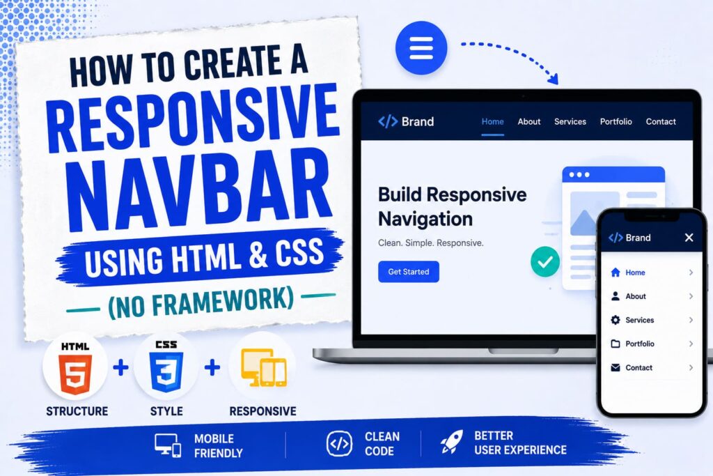
You can build a responsive navbar with only HTML and CSS, no framework needed. You use flexbox to line up the menu, a media query to change the layout on small screens, and a simple checkbox trick to open and close the menu on mobile, all without a single line of JavaScript. The full code is below, ready to copy.
A navbar is the menu at the top of a site that holds your main links. A responsive one looks great on a big screen and turns into a neat tap to open menu on a phone. Here is how to make one from scratch.
What Is a Responsive Navbar?
A navbar is your navigation menu, usually a row of links at the top of the page. Responsive means it changes to fit any screen. On a computer, the links sit in a row. On a phone, they hide behind a small menu button with three lines, called a hamburger icon. You get all of this with plain HTML and CSS.
The HTML
First, add this HTML where you want your navbar:
<nav class="navbar">
<a href="#" class="logo">MySite</a>
<input type="checkbox" id="menu-toggle" class="menu-toggle">
<label for="menu-toggle" class="menu-icon">☰</label>
<ul class="nav-links">
<li><a href="#">Home</a></li>
<li><a href="#">About</a></li>
<li><a href="#">Services</a></li>
<li><a href="#">Blog</a></li>
<li><a href="#">Contact</a></li>
</ul>
</nav>Here is what each part does:
- The nav holds the whole bar.
- The logo link is your site name or brand.
- The checkbox is hidden and controls the menu. This is the trick that replaces JavaScript.
- The label is the hamburger icon that a visitor taps.
- The ul is your list of menu links.
The CSS
Now add this CSS to your stylesheet, or inside a style tag in your page:
* {
  margin: 0;
  padding: 0;
  box-sizing: border-box;
}

.navbar {
  display: flex;
  align-items: center;
  justify-content: space-between;
  flex-wrap: wrap;
  background: #1a1a2e;
  padding: 15px 30px;
}

.logo {
  color: #ffffff;
  font-size: 22px;
  font-weight: bold;
  text-decoration: none;
}

.nav-links {
  display: flex;
  list-style: none;
  gap: 25px;
}

.nav-links a {
  color: #ffffff;
  font-size: 16px;
  text-decoration: none;
}

.nav-links a:hover {
  color: #4dabf7;
}

.menu-toggle {
  display: none;
}

.menu-icon {
  display: none;
  color: #ffffff;
  font-size: 26px;
  cursor: pointer;
}

@media (max-width: 768px) {
  .menu-icon {
    display: block;
  }

  .nav-links {
    display: none;
    width: 100%;
    flex-direction: column;
    gap: 15px;
    margin-top: 15px;
  }

  .menu-toggle:checked ~ .nav-links {
    display: flex;
  }
}
In short, flexbox places the logo on the left and the links on the right. The hamburger icon stays hidden on big screens. Then the media query takes over on screens 768 pixels and smaller, where it shows the hamburger, hides the links, and stacks them.
How the Mobile Menu Works
The clever part is the checkbox. It is hidden, but the hamburger label is connected to it. When a visitor taps the hamburger, the checkbox is ticked. The CSS line that reads .menu-toggle:checked ~ .nav-links then shows the menu. Tap again, and it hides. That is how you get a working menu with no JavaScript at all.
How to Use It on Your Site
- Add the HTML at the top of your page, where you want the navbar.
- Add the CSS to your stylesheet or inside a style tag.
- Change the logo text and the menu links to your own.
- Save the page, then drag your browser narrower to watch it adapt.
Easy Ways to Customize It
- Change the colors by editing the background and text color values.
- Move the breakpoint by changing 768px to another width.
- Swap the hamburger icon for a small image if you prefer.
- Adjust the hover color so links feel more interactive.
Common Problems and Fixes
- The menu will not open: make sure the checkbox comes before the nav-links in your HTML, since the trick needs that order.
- The links do not stack on mobile: check that your media query width matches the screen you are testing.
- Everything looks squished: confirm you added box-sizing: border-box.
- The hamburger shows on desktop: keep .menu-icon set to display none outside the media query.
Frequently Asked Questions
Can I make a navbar without a framework?
Yes. Plain HTML and CSS are enough for a clean, responsive navbar, as this guide shows. You do not need Bootstrap or any other framework.
Do I need JavaScript for the mobile menu?
No. The hidden checkbox trick opens and closes the menu using only CSS, so no JavaScript is needed.
What is the best breakpoint for a navbar?
768 pixels is a common choice, since it is around tablet size. You can change it to fit your own design.
Will this work on all browsers?
Yes. Flexbox, media queries, and the checkbox trick all work in every modern browser.
How do I add a dropdown to this navbar?
You can place a nested list inside a menu item. For a richer dropdown with click effects, see my jQuery dropdown menu guide.
Final Words
A responsive navbar does not need a framework or any JavaScript. With flexbox, a single media query, and a hidden checkbox, you get a menu that looks clean on every screen. Copy the code above, change the logo and links to your own, and you have a working navbar in minutes.
Once it is in place, keep building your front end skills with my jQuery dropdown menu tutorial, and make sure your pages stay fast with my guide on improving Core Web Vitals.